Redefine Your Brand with Timeless Design
Overview
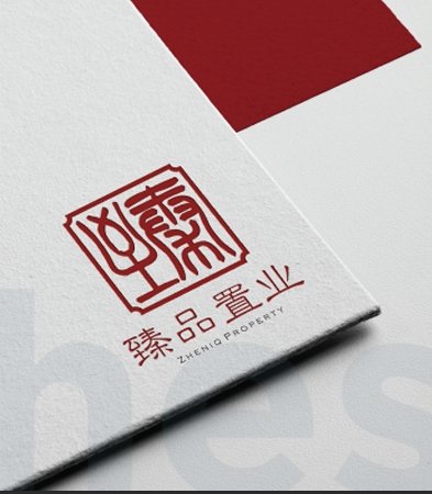
Zheniq Property is a premier real estate development and investment company based in Kota Kinabalu, Sabah, dedicated to crafting luxury living spaces with cultural significance. The name “Zheniq” combines the Chinese character ‘臻’ (Zhēn)—symbolizing excellence and prosperity—with the concept of ‘Zen’ and ‘unique’, reflecting the brand’s commitment to sophisticated and harmonious property development.
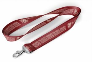
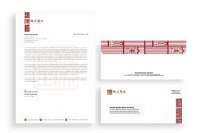
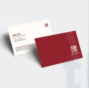
To align with Zheniq Property’s vision of minimalistic elegance, we designed a modern yet culturally rooted logo, integrating architectural influences and traditional Chinese elements. This branding approach emphasizes the company’s heritage, blending Eastern aesthetics with contemporary real estate excellence.
The Challenges
One of the key challenges was creating a luxurious yet minimalistic brand identity that resonated with both local and international investors. The real estate market in Kota Kinabalu is highly competitive, requiring strong visual differentiation to stand out among industry leaders.
Additionally, incorporating traditional Chinese elements into a modern, premium brand identity needed a careful balance. The goal was to make the logo timeless, aesthetically pleasing, and reflective of Zheniq’s high-end property developments.
Services
Branding & Visual Identity
Typography & Color Strategy
Results
Our branding solution successfully positioned Zheniq Property as a premium and culturally significant real estate developer. The modern yet traditional logo strengthened the brand’s identity, resonating with potential investors and homebuyers.
The architectural symbolism and heritage-inspired elements established Zheniq as a unique player in Sabah’s property market, setting the foundation for strong brand recognition and trust among clients.